Sales Supervisor Portal
Internal web application for Febeca's sales force that replaces the daily Excel report with a portal where each supervisor sees only their own team, with performance traffic lights, sales contests and accounts receivable.
Stack
- Next.js
- TypeScript
- Supabase
- Tailwind CSS
- PostgreSQL
- Netlify
Internal web portal for the sales supervisors at Febeca, a wholesale hardware distributor. It brings together in one place what each supervisor needs to follow their team through the month.
The problem
Once a day, each supervisor received an Excel file by email with their team’s progress. The data existed; what did not exist was a reasonable way to read it.
The file carried the rows of every supervisor, not just their own, plus the figures of other companies in the group, which were of no use to them. Finding their own numbers meant filtering by hand through a file full of other people’s data, laid out in a structure that was unintuitive and hard to read.
A report that arrived on time every day and that hardly anyone made use of. And that was only the sales report: other things a supervisor needed to know did not even have a place to be looked up.
The solution
A portal where everyone signs in with their own account and sees only their own team. Seven sections:
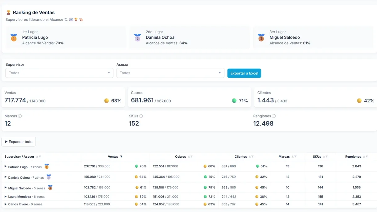
- Dashboard — the team’s progress: sales and collections against budget, customer portfolio, activated customers and invoiced line items, each with its traffic light.
- Accounts receivable — what each customer owes, with the days of credit overdue.
- Brands — each supervisor’s performance by brand in the current month.
- Active terms — the promotions and terms currently in force for each brand.
- Paint — paint sales broken down to the customer, with the thresholds of the category’s sales contest.
- Line items — each sales rep’s progress in the incentive contest and how far they are from the next tier.
- Announcements — notices from management: promotions, contests and news.
The traffic light is measured against the month elapsed, not against the budget. Knowing that a rep is at 40% of their target says nothing on its own: on the 10th they are ahead, on the 28th they are in trouble. Each indicator is compared with the share of the month that has already gone by, so the screen answers are we on track? instead of how much have we done?.
The data does not arrive ready
None of the sources can be shown as they come. They are reports built for something else: they carry raw data, with the columns that suit the system that produced them rather than the ones a supervisor needs. Between that file and the screen there is work to do: normalizing, joining different sources, applying the business rules and aggregating along whichever dimension each view calls for.
That work is done once, when the data is loaded, not on every visit. A preliminary step goes through the tens of thousands of rows of transaction detail and keeps only what each screen needs; the browser receives the result already aggregated. Before, every browser repeated it on every visit, only to reach the same result each time: the heaviest pages took more than ten seconds to load. Today they take under two, and download around 100 kB instead of almost 10 MB.
A section that replaced a chat
Active terms replaced a WhatsApp group. The promotions in force for each brand used to be announced there, mixed in with the supervisors’ daily conversation, so finding a specific term meant digging through the chat and trusting that nobody had changed it afterwards. Now they live in one place, sorted by brand, and are looked up instead of remembered.
Seven sections, for now
The portal was not born with these seven sections. It started in April with the Dashboard alone and grew as needs appeared: Brands and Announcements were added in May; Accounts receivable in June; Active terms in July; Paint in August; and Line items in September.
None of them was part of an initial plan: each one came in when it was needed. Today’s list is not the final one, just the one so far. Development is still active, and the portal will keep adding sections the way it has from the start.
My role
I am the sole developer on the project: interface design, frontend, data model and deployment. Around 14,000 lines of TypeScript in five months, and still growing.
- Frontend: Next.js with the App Router, TypeScript and Tailwind CSS, designed mobile first: supervisors also open it on a desktop, but they mostly check it on their phones.
- Installable app (PWA): the portal installs on the phone as an app in its own right, not as a shortcut to a link. It gets its icon alongside the other apps, opens full screen without the browser bar and shows up separately in the task switcher. It deliberately caches nothing: an offline version could show another day’s figures, and in a daily report that is worse than not loading.
- Data: precomputation of several spreadsheet sources, among them a transaction detail of tens of thousands of rows, which the browser receives already aggregated.
- Authentication and permissions: Supabase, with two main roles: the supervisor, who only sees the data of the sales reps they supervise, and the manager, who sees all the data without restriction. Roles are stored in PostgreSQL with row-level security policies, and the data in private storage that only responds to a signed-in session. The access rules live in a separate module so that no screen improvises its own.
- Exports: Excel and PDF of the filtered view, and a zipped batch with one file per supervisor.
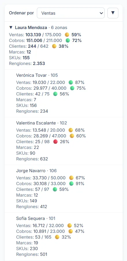
On the phone, the table stops being a table: each row becomes a card read from top to bottom. Several columns on a narrow screen would force sideways scrolling to read.

The same team on the desktop, where it becomes a table again: there, what matters is comparing reps with one another by reading down a column.
Project status
In production and in daily use for five months, with active development. It is used by the ten supervisors, sales management and the five people in sales administration.
It is an internal tool: it is deployed on the web and its code lives in a GitHub repository, but out of confidentiality to the company this case does not link to the site or to the code. For the same reason, the screenshots use sample data.
Data loading is manual and daily, and it is worth being precise about how far that goes. Direct API access to the ERP is not available to the department, so every day I extract the reports and load them.
That is where the manual part ends. The files go in exactly as they come out of the system: they are not edited, reordered or formatted. All the cleaning, the joins between sources, the calculations and the aggregations are written in code and run on their own. The alternative — hand-building an Excel file every day in the exact format the application expects — would be slower, more fragile and would have to be repeated on every load. Within the constraint there is, this is everything that could be automated.
If the company opens direct access to the data tomorrow — an API, an endpoint, a database connection or a backend that serves it in real time — only the part that reads it today would have to change. The tables, filters, traffic lights and exports would stay the same, because they never knew where the data came from.